Loading...
CSS 认知概括
- 元素语义化的作用
- 方便代码维护
- 减少开发者之间的沟通成本
- 能让语音合成工具正确识别网页元素的用途,以便做出正确的反应
- 有利于 SEO
- CSS 书写顺序(规范)
-
定位(position)和布局(Layout)
position、top/bottom/left/right、z-index、float/clear、flex(flex-direction、justify-content、align-item ...)
-
展示(display)和可见(visibility)
display、opacity、visibility
-
盒子模型(Box Model)顺序
margin、box-shadow、border、border-radius、width/height、padding
-
背景设置(background)
-
字体(font)、文本(text)
font-family/font-size/font-weight/font-style、line-height、text-align/text-transform、color
-
其它属性
overflow、clip、cursor、transform、animation、transition、withe-space
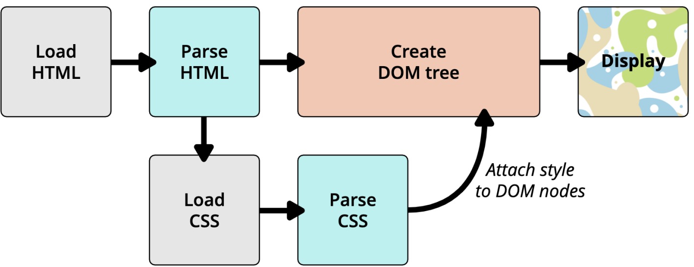
- 浏览器渲染流程 自上而下依次解析,解析到外部链接时
CSS 基本属性
文本属性
-
text-decoration 文本添加横线(下划线:
underline、删除线:line-through、上划线:overline、去除横线:none) -
text-transform 针对英文的大小写转换(首字母大写:
capitalize、所有字符大写:uppercase、所有字符小写:lowercase、无影响:none) -
text-indent 首行文本缩进两个字符:
2em -
text-align(重要) 定义行内内容(例如文字[inline / inline-block])相对于它的块级父元素对齐
align、left、rightjustify:两端对齐,需配合其它 css 使用,只有一行情况下无法实现。.text { /* 内容多行的情况下,除最后一行,其余内容都会两端对齐 */ text-align: justify; /* 最后一行也两端生效 */ text-align-last: justify; }text-align只针对行内或行内块元素相对于父级块元素居中,无法使块级元素在块级元素内居中。需使用margin:0 auto;
-
word/letter-spacing
letter-spacing、word-spacing分别用于设置字母、单词之间的间距
字体属性
- font-size
px em,其中,em 是对父元素字体的继承,1em=父元素的font-size - font-family 设置文字的字体名称。浏览器会选择列表中第一个该计算机上有安装的字体。或者是通过
@font-face指定的可以直接下载的字体 - font-weight 文字粗细。[100-900],
normal为 400,bold为 700,常用为 700 - font-style 常规显示:
normal、斜体:italic(文字样式本身支持斜体)、倾斜:oblique(强制文字倾斜) - font-variant 常规显示:
normal、小写字母替换为大写字母:small-caps(本身依旧是小写字母高度) - line-height 两行文字基线(baseline)之间的间距。string/number,纯数值,则是相对于父级字体的倍数相乘
- font font 属性可以用来作为
font-style,font-variant,font-weight,font-size,line-height和font-family的简写- font-style、font-variant、font-weight 可以随意调换顺序,也可以省略
- /line-height 可以省略,如果不省略,必须跟在 font-size 后面
- font-size、font-family 不可以调换顺序,不可以省略
CSS 常见选择器
-
通用选择器(universal selector):*
-
元素选择器(type selectors):
p span a -
id 选择器(id selectors):
#my-id -
类选择器(class selectors):
.my-class -
属性选择器(attribute selectors)
- 拥有某一个属性
[att] - 属性等于某个值
[att=val]
<style> /* 选择 attribute 有 title 的节点 */ [title] { color: red; } /* 选择 attribute 的 title为 one 的节点 */ [title='one'] { color: blue; } </style> <div title="one">one</div> <div title="two">two</div>- 了解:
[attr*=val]: 属性值包含某一个值 val;[attr^=val]: 属性值以 val 开头;[attr$=val]: 属性值以 val 结尾;[attr|=val]: 属性值等于 val 或者以 val 开头后面紧跟连接符-;[attr~=val]: 属性值包含 val, 如果有其他值必须以空格和 val 分割
- 拥有某一个属性
-
后代选择器:所有后代(直接/间接的后代):
div .home {...}; 直接子代选择器(必须是直接子代):div > .home{...} -
兄弟选择器:
<style> /* 相邻兄弟选择器 使用符号 + 连接*/ .one + div { color: red; /* 会把 tow 变红 */ } /* 普遍兄弟选择器 使用符号 ~ 链接 */ .one ~ div { color: blue; /* 会把 tow - four 都变蓝 */ } </style> <div class="one">one</div> <div>two</div> <div>three</div> <div>four</div> -
选择器组:
<style> /** 交集选择器 */ div.one { /** 注意:和 div .one 的效果时不同的 div .one 是 div 下的 .one 类名 div.one 是 div 中有 .one 类名 */ color: red; } /** 并集选择器 */ div, p { font-size: 20px; } </style> <div class="one">one</div> <p>this is p</p> -
伪类
- 动态伪类:
a:正常编写顺序为::link、:visited、:hover、:activea:link未访问的链接a:visited已访问的链接a:hover鼠标挪动到链接上(重要),其中:hover必须放在:link和:visited后面才能完全生效a:active激活时的链接(鼠标在链接上长按住未松开,其中:active必须放在:hover后面才能完全生效
:focus:指当前拥有输入焦点的元素(能接收键盘输入)- 文本输入框一聚焦后,背景就会变红色
- a 元素可以被键盘的 Tab 键选中聚焦,所以
:focus也适用于 a 元素。书写顺序::link、:visited、:focus、:hover、:active
- 目标伪类:
:target - 语言伪类:
:lang() - 元素状态伪类:
:enabled、:disabled、:checked - 结构伪类:
:nth-child()、:nth-last-child()、:nth-of-type()、:nth-last-of-type():first-child、:last-child、:first-of-type、:last-of-type:root、:only-child、:only-of-type、:empty
- 否定伪类:
:not()
- 动态伪类:
-
伪元素:为了区分伪元素和伪类,建议伪元素使用 2 个冒号,比如
::first-line。默认为行内元素-
:first-line、::first-line -
:first-letter、::first-letter
<style> .box::first-line { /* 首行文本会变色 */ color: lightblue; } .box::first-letter { /* 首字母/字 字体变大 */ font-size: 20px; } </style> <div class="box">React是用于构建用户界面的 JavaScript 库</div>:before、::before:after、::after
.box::before { /* .box 前方插入内容*/ content: '1. '; color: red; font-size: 20px; } .box::after { /* box 后方插入 svg */ content: url('./images/my.svg'); background-color: blue; } -
CSS 特性
属性继承、层叠、元素类型。
继承
常见继承属性: color、cursor、font-family、font-size、font-style、font-variant、font-weight、font letter-spacing、line-height、list-style、text-align、text-indent、text-shadow、 visibility、white-space、word-space、word-break、word-spacing、word-wrap
强制继承:
<style>
  .box {
    color: red;
    border: 2px solid blue; /* 正常 p 标签是无法继承 box 的 border 样式的 */
  }

  .box p {
    border: inherit; /** 让 p 标签强制继承父元素的 border */
  }
</style>

<div class="box">
  <p>this is p</p>
</div>
如下图所示
层叠
权重越大,样式优先级更高同权重下,同样式下,后设置优先级更高
!important:10000- 内联样式(
style="color: red;"):1000 - id 选择器(
"#id"):100 - 类选择器(
".class")、属性选择器("[attr]")、伪类(":hover"):10 - 元素选择器(
"p")、伪元素("::before"):1 - 通配符(
"*"):0
元素的类型
块级元素、行内元素、行内块元素可以通过 display 设置元素的类型
block:让元素显示为块级元素- 独占父元素的一行
- 可以随意设置宽高(设置后依旧独占一行)
- 高度默认由内容决定
inline:让元素显示为行内级元素- 跟其他行内级元素在同一行显示
- 不可以随意设置宽高
- 宽高都由内容决定
inline-block:让元素同时具备行内级、块级元素的特征- 跟其他行内级元素在同一行显示
- 可以随意设置宽高
- img、video 属于 行内替换元素,可以设置宽高,但不属于行内块级元素
none:隐藏元素
CSS 属性
-
HTML 编写注意事项
- 块级元素、inline-block 元素
- 一般情况下,可以包含其他任何元素(比如块级元素、行内级元素、inline-block 元素)
- 特殊情况,p 元素不能包含其他块级元素
- 行内级元素(比如 a、span、strong 等)
- 一般情况下,只能包含行内级元素
- 块级元素、inline-block 元素
-
元素隐藏方法
display: none;- 元素不显示出来, 并且也不占据位置, 不占据任何空间(和不存在一样);
visibility: hidden;- 设置为 hidden, 元素不可见,。会占据元素应该占据的空间;
- 默认为 visible, 元素是可见的;
background-color: rgba(x,x,x,0);- rgba 的 a 设置的是 alpha 值, 可以设置透明度, 不影响子元素;
opacity: 0;- 设置整个元素的透明度, 会影响所有的子元素。会占据元素应该占据的空间;
-
overflow:用于控制内容溢出时的行为
visible:溢出的内容照样可见hidden:溢出的内容直接裁剪scroll:溢出的内容被裁剪,但可以通过滚动机制查看。会一直显示滚动条区域,滚动条区域占用的空间属于 width、heightauto:自动根据内容是否溢出来决定是否提供滚动机制
CSS 盒子模型
HTML 中的每一个元素都可以看做是一个盒子,可以具备 4 个属性
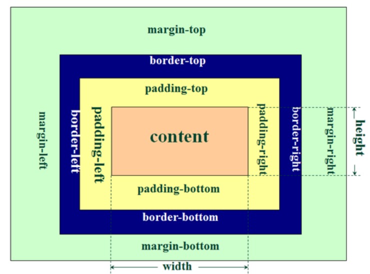
基础属性
width height 宽高
内容区域为:width height。也可以设置:min-width、max-width、min-height、max-height padding 的缩写的顺序为:top right bottom left
padding 内边距
| padding 值的个数 | padding 例子 | 代表的含义 |
|---|---|---|
| 4 | padding: 10px 20px 30px 40px; | top: 10px, right: 20px, bottom: 30px, left: 40px; |
| 3 | padding: 10px 20px 30px; | 缺少 left, left 使用 right 的值; |
| 2 | padding: 10px 20px; | 缺少 left, 使用 right 的值; 缺少 bottom, 使用 top 的值; |
| 1 | padding: 10px; | top/right/bottom/left 都使用 10; |
border 边框
- width:四个属性(
border-(top/right/bottom/left)-width)。border-width是四个属性的简写。 - color:四个属性(
border-(top/right/bottom/left)-color)。border-color是四个属性的简写。 - style:四个属性(
border-(top/right/bottom/left)-style)。border-style是四个属性的简写。- 8 种可选参数:solid(实线) dashed(虚线) dotted(圆点线) double(双实线)inset(上左粗黑实线,下右粗浅实线)outset(与 inset 相反)groove(双粗实线。外侧是 inset,内侧是 outset)ridge(双粗实线。外侧 outset,内侧 inset)
- 总缩写:
1px solid red。顺序可调换。其中 solid 属性不可省略,1px 和 red 可省略
<style>
  .border-class {
    width: 200px;
    height: 100px;
    border-width: 5px;
    border-color: red blue green orange;
    border-style: solid dashed dotted double;
  }
</style>
<div class="border-class"></div>
margin
- margin 属性用于设置盒子的外边距, 通常用于元素和元素之间的间距
- margin 四个属性缩写:
margin-(top/right/bottom/left)
上下 margin 的传递
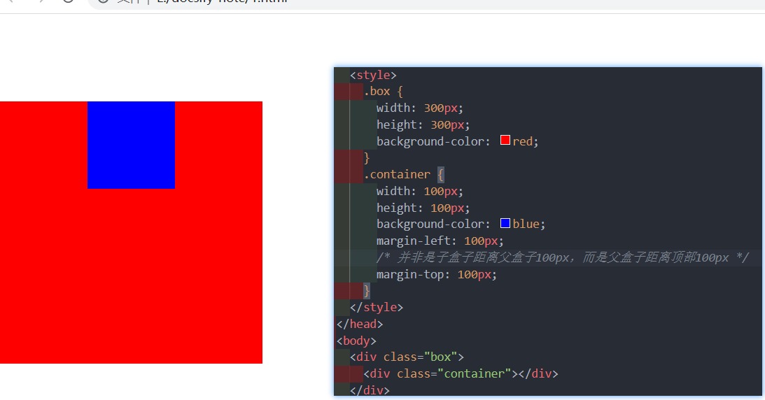
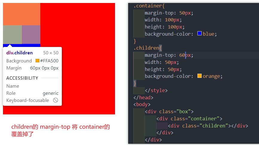
- margin-top 传递
- 如果块级元素的顶部线和父元素的顶部线重叠,那么这个块级元素的 margin-top 值会传递给父元素
- margin-bottom 传递
- 如果块级元素的底部线和父元素的底部线重写,并且父元素的高度是 auto,那么这个块级元素的 margin-bottom 值会传递给父元素
解决方法
- 不使用子元素设置 marigin,给父元素设置 padding-top\padding-bottom
- 给父元素设置 border
- 触发父元素的 BFC,使其独立空间,不受其它影响: 设置 overflow 为 auto
上下 margin 的折叠
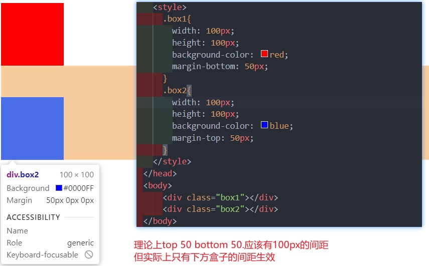
- 垂直方向上相邻 2 个 margin(margin-top、margin-bottom)有可能会合并为 1 个 margin,这种现象叫做 collapse(折叠)
- 水平方向上的 margin(margin-left、margin-right)永远不会 collapse
折叠后最终值的计算规则: 两个值进行比较,取较大的值
如何防止 margin collapse?只设置其中一个元素的 margin
- 两个兄弟块级元素之间上下 margin 的折叠
- 见上图
- 父子块级元素之间 margin 的折叠
常用属性
border-radius 圆角
- 数值(5px)、百分比(50%)。当盒子为正方形盒子时,设置
border-radius: 50%;则会成为一个圆 - border-radius 是四个属性的简写:
border-(top-left/top-right/bottom-left/bottom-right)-radius
outline 外轮廓
- outline-width: 外轮廓的宽度
- outline-style:取值跟 border 的样式一样,比如 solid、dotted 等
- outline-color: 外轮廓的颜色
- outline:outline-width、outline-style、outline-color 的简写属性,跟 border 用法类似
- 去除 a 元素、input 元素的 focus 轮廓效果。
outline: none;
box-shadow 盒子阴影
偏移量是以 x、y 轴为坐标系。网页上以网页左上角为 坐标系 0,0 原点。
box-shadow: offset-x offset-y blur-radius spread-radius color inset;。可以一次设置多个阴影,中间用 , 隔开
- offset-x:px。水平方向的偏移,正数往右偏移
- offset-y: px。垂直方向的偏移,正数往下偏移
- blur-radius: px。模糊半径,向外扩散距离,不设置则为 0,不模糊
- spread-radius:px。延伸半径。在原有基础上向四周扩散的距离
- color:tgba。阴影的颜色,如果没有设置,就跟随 color 属性的颜色
- inset:
inset。直接加上这个属性,模糊向内扩散(正常是向外扩散)。基本不用。
text-shadow
类似于 box-shadow,用于给文字添加阴影效果。相当于 box-shadow, 它没有 spread-radius 和 inset的值
行内非替换元素
- 以下属性对行内级非替换元素不起作用: width、height、margin-top、margin-bottom
- 以下属性对行内级非替换元素的效果比较特殊 padding-top、padding-bottom、上下方向的 border。padding 在视觉上会被撑起来,但实际上并不占用空间。
<style>
  .line-span {
    background-color: red;
    color: white;
    /* width和height对于行内非替换元素不生效 */
    width: 300px;
    height: 300px;

    /* padding */
    padding: 50px;
    /* border 上下被撑起,但不占空间 */
    border: 10px solid blue;
    /* margin 上下不生效*/
    /* margin: 50px; */
  }
</style>
<body>
  <span class="line-span"> 我是span内容 </span>
  aaaaa
  <div>bbb</div>
</body>
box-sizing
content-box:默认的 div 就是content-box,padding、border 都布置在 width、height 外边,总宽高会受到内容的影响而变化。border-box:padding、border 都布置在 width、height 里边,总宽高不变,会对内容进行压缩
盒子模型分为 W3C 标准盒模型和 IE 盒模型。W3C 标准盒模型中设置的宽高,仅仅是对内容设置,而不包括 border、padding。IE 盒模型(IE8 以下浏览器)会默认设置
box-sizng: border-box;,设置的宽高包括内容、border、padding。
background
background-image
background-image 用于设置元素的背景图片
- 会盖在(不是覆盖)
background-color的上面 - 如果设置了多张图片, 设置的第一张图片将显示在最上面,其他图片按顺序层叠在下面。
background-image: url(...imgs/...), url(...imgs/...);
注意:如果设置了背景图片后,元素没有具体的宽高,背景图片是不会显示的
background-repeat
background-repeat 用于设置背景图片是否要平铺
- 常见的设值有
- repeat:平铺
- no-repeat:不平铺
- repeat-x:只在水平方向平铺
- repeat-y:只在垂直平方向平铺
- x 轴向右为正值,y 轴向下为正值
默认为平铺
repeat
background-size
background-size 用于设置背景图片的大小
- auto:默认值, 以背景图本身大小显示
- cover:缩放背景图,以完全覆盖铺满元素,可能背景图片部分看不见。以较短边为主进行拉伸
- contain:缩放背景图,宽度或者高度铺满元素,但是图片保持宽高比
<percentage>:百分比,相对于背景。background-size: 100% 100%;- length:具体的大小,比如
background-size: 100px 100px;
background-position
background-position 用于设置背景图片在水平、垂直方向上的具体位置
- 可以设置具体的数值 比如 20px 30px;
- 水平方向还可以设值:left、center、right
- 垂直方向还可以设值:top、center、bottom
- 如果只设置了 1 个方向,另一个方向默认是 center
背景图片在浏览器拉伸的情况下只显示中间区域,设置 center 即可。
background-attachment
background-attachment 控制在滚动区域内,背景图片是否随滚动区域而滚动
- scroll:背景相对于元素本身固定, 而不是随着它的内容滚动
- local:背景相对于元素的内容固定。如果一个元素拥有滚动机制,背景将会随着元素的内容滚动.
- fixed:背景相对于视口固定。即使一个元素拥有滚动机制,背景也不会随着元素的内容滚动。(浏览器窗口上下滚动,默认是内容和图片所在的区域一起上下滚动,设置 fixed,就算内容滚动,图片也不滚动)
默认是 scroll 不滚动,随所在视窗滚动是 loacal。固定图片在浏览器视窗中的位置,使用 fixed
background
background 是一系列背景相关属性的简写属性
语法:<bg-color> || <bg-image> || <bg-position> [ / <bg-size> ] ? || <repeat-style> || <attachment> || <box> || <box>
写法例子:background: #ff0000 url(../img/a.jpg) top 30px/50px 50px no-repeat scroll;
background-image 和 img 对比
| img | background-image | |
|---|---|---|
| 性质 | HTML 元素 | CSS 样式 |
| 图片是否占用空间 | √ | × |
| 浏览器右键直接查看地址 | √ | × |
| 支持 CSS Sprite 精灵图 | × | √ |
| 更有可能被搜索引擎收录 | √(结合 alt 属性) | × |
总结
- img,作为网页内容的重要组成部分,比如广告图片、LOGO 图片、文章配图、产品图片
- background-image,可有可无。有,能让网页更加美观。无,也不影响用户获取完整的网页内容信息